Layouts
A layout splits the display into boxes, and each box shows one thing: a text, an icon, a chart, a progress bar or a drawing. Use it to show a title above a value, or an icon next to two lines of text.
New here?
How the display works shows where things sit on the display and which text moves by itself.
What you get
This pushed app shows an icon on the left and a temperature next to it. Replace <awtrix-ip> with
the IP address of your clock:
curl -X PUT http://<awtrix-ip>/api/v1/apps/pushed/weather \
  -H 'Content-Type: application/json' \
  -d '{"layout":{"version":1,"regions":[{"id":"icon","box":[0,4,8,8],"icon":"sun"},{"id":"temp","box":[9,0,43,16],"text":"21.5°C"}]}}'

The sun sits in the left 8 columns, and the temperature in the middle of the space next to it.
sun is an icon from the AWTRIX Hub.
How it behaves
- A layout is the
layoutblock in the JSON of a pushed app or a notification. A script can draw one too. Nothing is saved on the clock as a file. - Boxes count all 52 × 16 pixels. A box is
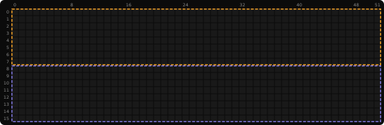
[x, y, width, height], counted from the top-left corner of the display:[0, 8, 52, 8]is the lower half. A pushed app or a notification without a layout is different: it is drawn at double size, on a grid of 26 × 8. - AWTRIX places the content in its box, in the middle unless
alignandvalignsay otherwise. Text that does not fit moves through its box. - A box shows only what fits into it. The rest is cut off at its edge. Fonts and images keep their size.
- A layout replaces the other drawing keys.
text,icon,draw,effectand the like go into the layout instead.
How the display works shows boxes and their content with pictures.
Place the boxes
Each entry of regions has an id, a box and the one thing it shows. The id is a name you
choose, once per layout. The box must lie completely inside the display:
| Area | box |
|---|---|
| Whole display | [0, 0, 52, 16] |
| Top half | [0, 0, 52, 8] |
| Bottom half | [0, 8, 52, 8] |
A title above a value:
{
  "durationMs": 10000,
  "layout": {
    "version": 1,
    "regions": [
      {"id": "title", "box": [0, 0, 52, 8], "text": "TEMPERATURE", "font": "matrix-light6"},
      {"id": "value", "box": [0, 8, 52, 8], "text": "22.4°C", "font": "matrix-chunky8x6", "color": "#00AAFF"}
    ]
  }
}
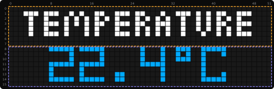
Send it like any other app: as the body of PUT /api/v1/apps/pushed/<name>, or of
POST /api/v1/notifications. Over MQTT, use the normal
pushed-app and notification topics.
The regions are drawn in list order. Where two boxes overlap, the later one is on top.
Show a chart and a progress bar
A title with a bar chart and a battery bar below it:
{
  "layout": {
    "version": 1,
    "regions": [
      {"id": "title", "box": [0, 0, 52, 8], "text": "ENERGY", "font": "matrix-light6"},
      {"id": "load", "box": [0, 9, 40, 7], "chart": {"values": [20, 40, 30, 75], "type": "bar", "min": 0, "max": 100}},
      {"id": "battery", "box": [43, 9, 9, 7], "progress": 75, "color": "#00FF00"}
    ]
  }
}
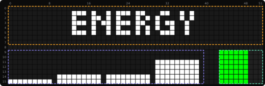
chartdraws a line through itsvalues, or bars with"type": "bar". Withminandmax, the chart has a fixed scale. Without them, it scales itself.progressis 0 to 100. It fills its box from the left.
Everything a box can show, with its options: What a region can show.
Color a text
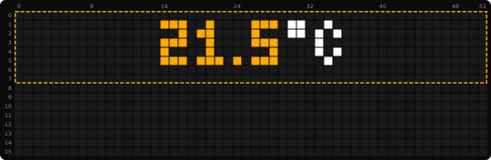
text can also be a list of parts, each with its own color. A part without color uses the
region's color:
{
  "layout": {
    "version": 1,
    "regions": [
      {"id": "temp", "box": [0, 0, 52, 8], "text": [{"text": "21.5", "color": "#FFAA00"}, {"text": "°C"}]}
    ]
  }
}
From a palette
Set color (or textColor) to "palette" to take the colors of a text, chart or progress bar
from a palette. The palette comes from the region's own palette key, or else from the layout's:
{
  "layout": {
    "version": 1,
    "regions": [
      {"id": "value", "box": [13, 0, 35, 16], "text": "12 µg/m³", "textColor": "palette", "palette": "Rainbow"}
    ]
  }
}
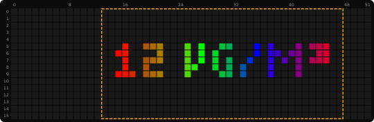
palette takes a palette name, a list of colors or a list of {color, pos} stops, as described in
Palettes. paletteBlend, paletteSpan and paletteSpeed work
as in an app without a layout. They need a palette next to them.
Let a text move through its box
Text that does not fit moves through its box by itself. A text region takes the same
scroll options as the text key, for example "scroll": "loop".
Without scroll, the scroll settings of the clock are used. repeat next to layout keeps the
app shown until every moving text has run that many times:
curl -X PUT http://<awtrix-ip>/api/v1/apps/pushed/outside \
  -H 'Content-Type: application/json' \
  -d '{"repeat":1,"layout":{"version":1,"regions":[{"id":"title","box":[0,0,52,8],"text":"OUTSIDE","font":"matrix-light6"},{"id":"value","box":[0,8,52,8],"text":"21.5°C, humidity 40 %","color":"#00AAFF","scroll":"loop"}]}}'
repeatgoes next tolayout, not intoscroll.- A region can set its own
repeat. With0, the app does not wait for that region. - Text that stands still never keeps the app.
Update a layout
Send the layout again to change it. Regions are matched by id: a text that did not change keeps
moving where it was, even if you changed the order of the regions. A region whose text, font, box
or scroll options change starts again from the beginning.
If an update has a mistake, for example a box outside the display, an unknown font, effect or palette, an icon that cannot be loaded, or too much content, the whole update is refused with an error. The previous content stays shown.
Use a layout in a script
A script does not need a layout: the drawing calls such as
text(x, y, …), icon(name, x, y), rect_fill() and scroll_text(x, y, w, …) take positions
themselves. A layout saves work when you want boxes that align, scroll or show a chart, or when
you already have the layout JSON of a pushed app.
Declare # @needs layout and import layout. Prepare a layout once and draw it in draw():
# @needs layout
import layout

class App
  var page
  def setup()
    self.page = layout.prepare({
      'version': 1,
      'regions': [
        {'id': 'main', 'box': [0, 0, 52, 16], 'text': 'Hello', 'font': 'matrix-light6'}
      ]
    })
  end
  def draw()
    layout.draw(self.page)
  end
end
return App()

| Call | What it does |
|---|---|
layout.prepare(spec) |
checks the layout and returns a handle for it |
layout.update(handle, spec) |
replaces the layout behind a handle and returns true |
layout.draw(handle) |
draws it. Call it in draw(). Returns true once every text with a repeat has finished |
layout.release(handle) |
frees a handle |
prepareandupdateraisevalue_errorfor a wrong layout. Catch it when the content comes from outside, such as a web request.layout.draw()first fills the display with the layout's background. Draw your own graphics after it.- Handles are freed when the script is removed, replaced or stopped by an error.
Good to know
- If your layout fills only the top-left quarter, you counted its boxes on the 26 × 8 grid of a
pushed app. Boxes count all 52 × 16 pixels:
[0, 0, 52, 16]is the whole display. 422with"outside the display". A box reaches past the edge:[0, 8, 52, 16]would end at row 23. Nothing is changed.422with"not allowed with layout". The key named infieldbelongs into the layout. Move it into a region, or onto the layout itself.alignchanges nothing. It places a text only while the text stands still.- A script cannot prepare a fifth layout. One script holds at most four handles, and setting a
variable to
nildoes not free one. Calllayout.release()for each layout you are done with.
Details
Every key, range and limit of a layout.
What a region can show
Every region needs an id and a box, plus exactly one of text, icon, chart,
progress or draw. Each id may be used only once per layout.
| Content | Example | Options |
|---|---|---|
text |
"text": "Hello" |
font, color, palette, align, valign, scroll, repeat, textCase, textBlinkMs, textFadeMs |
icon |
"icon": "sun" |
align, valign |
chart |
"chart": {"values": [3, 7, 5]} |
type (line or bar), min and max, and the region's color and palette |
progress |
"progress": 75 |
color, palette, trackColor |
draw |
"draw": [["circle", 3, 3, 3, "#FF0000"]] |
color, font |
icontakes an icon ID or a data URL, like the normaliconkey. GIF and JPEG keep their own size, up to the size of the display. It also takes a web address. That picture fills the whole region: Pictures from the internet.charttakes up to 128 whole numbers. Withoutminandmax, the chart scales itself and always includes zero. If you set one of them, set both, withminsmaller thanmax.progressis 0 to 100. The empty part usestrackColor, dark gray (#202020) by default.align(left to right) andvalign(top to bottom) takestart,centerorend. Both default tocenter.alignplaces text only while it stands still, not while it moves.fontdefaults tosmall. Your clock's fonts are listed underfontsinGET /api/v1/capabilities, see The fonts.colordefaults to the text color setting, for text, charts, progress bars and drawings.textColoris the same option under its pushed-app name. Set only one of them.drawtakes the same commands as thedrawkey. Positions count from the top-left corner of the box, and anything outside the box is cut off. A command without a color uses the region'scolor.textCase,textBlinkMsandtextFadeMswork as in an app without a layout. By default, text follows the uppercase setting of the clock.
The whole layout
Next to version and regions, a layout takes:
| Key | What it does |
|---|---|
backgroundColor |
Fills the display before the regions are drawn. Black by default. |
effect |
Draws an effect as the background instead. Cannot be combined with backgroundColor. |
effectSpeed |
Speed of the effect, 0.1 to 10. |
overlay |
Draws an overlay, such as snow, on top of all regions. Without it, the clock's own overlay is shown. |
palette, paletteBlend, paletteSpan, paletteSpeed |
The palette of the effect, the overlay and every region that uses "palette" without its own palette. |
Effect and overlay names are listed in GET /api/v1/capabilities.
Keys next to the layout
A layout cannot be combined with text, icon, draw, effect, scroll or the other drawing
keys of the payload. These keys still work next to layout:
durationMs, repeat, lifetimeMs and lifetimeExpiry. Notifications also keep name, hold,
stack, wakeup and sound.
Scroll options
A text region takes a scroll mode such as "scroll": "loop", or an object with mode,
direction, entry, whenFits, speed, gap and holdMs. Speed 100 moves about 21 pixels per
second. speed and holdMs accept 0 to 1,000,000, gap 0 to 32,767.
- A region's own
repeataccepts 0 to 1,000,000. - A text with
speed: 0never finishes. - A notification with
holdstays until it is dismissed, as usual.
Limits
| Per layout | Limit |
|---|---|
| Regions | 16 |
| Scrolling texts | 8 |
| Icons | 4 |
| Chart values | 128 per chart |
| Text | 8192 bytes in total |
| Request size | 2 MiB over HTTP, 8192 bytes over MQTT (topic included), 16384 bytes from Berry |
Region id |
64 bytes |
A text region counts as scrolling unless it sets "scroll": "static", even if it fits. A script
holds at most four layout handles, all scripts together eight.
All layouts on the clock share one memory budget of 256 KiB: pushed apps, waiting notifications
and script handles. Layouts with icons use more of it than plain text. Replacing a layout briefly
needs room for the old and the new one. When the budget is full, the request is refused and the
display does not change. All limits are in GET /api/v1/capabilities under layouts.limits.
Related
- Text & colors: fonts and scroll options
- Charts & drawing: charts and drawings without a layout
- Icons: getting icons onto the clock
- App & notification payload: all other keys of an app
- Scripting guide: Berry scripts